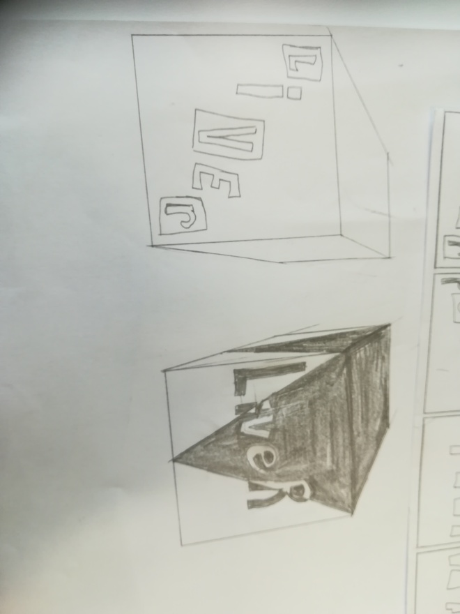
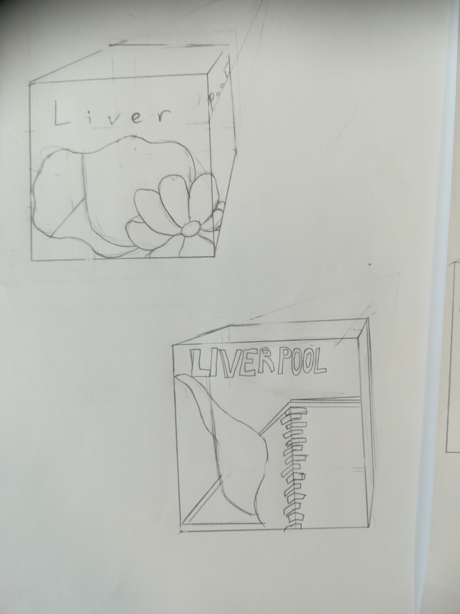
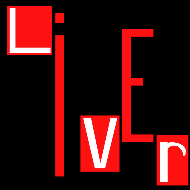
Packaging: Mug box

Making the design

Origonally I had never planned on using the design I ended up using so the first few desigsns don’t look like the Final product

IMG_20181017_134257.jpg
Simple designs I thought of using
IMG_20181017_134253.jpg
Toying with the idea of having a window
IMG_20181017_134234.jpg
More ideas, can see where I started developing the final design here
IMG_20181017_134240.jpg
Sketch of the final design on a net

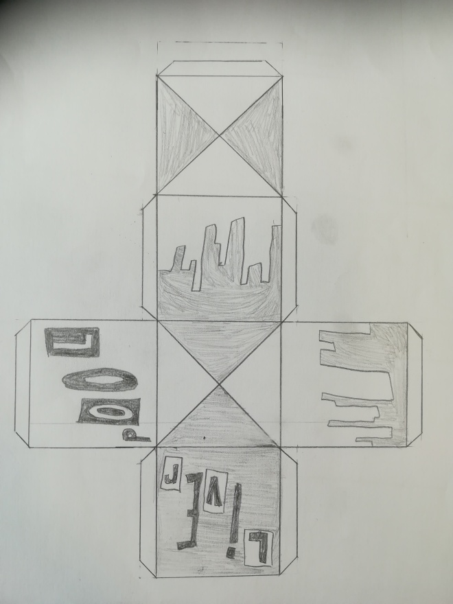
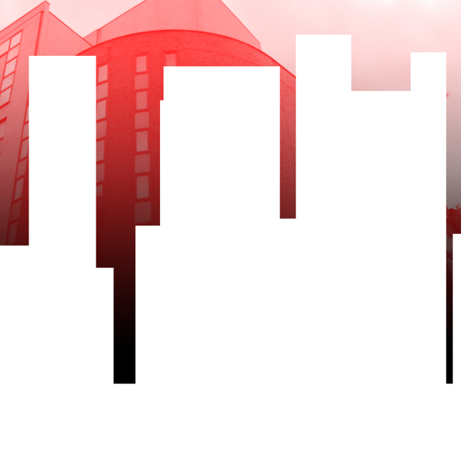
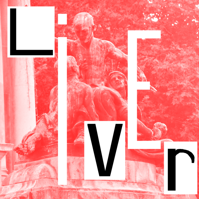
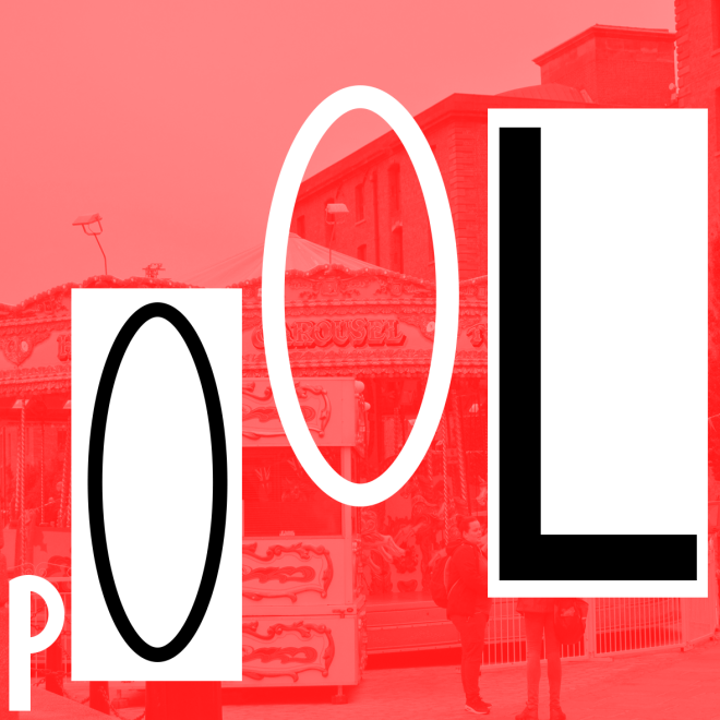
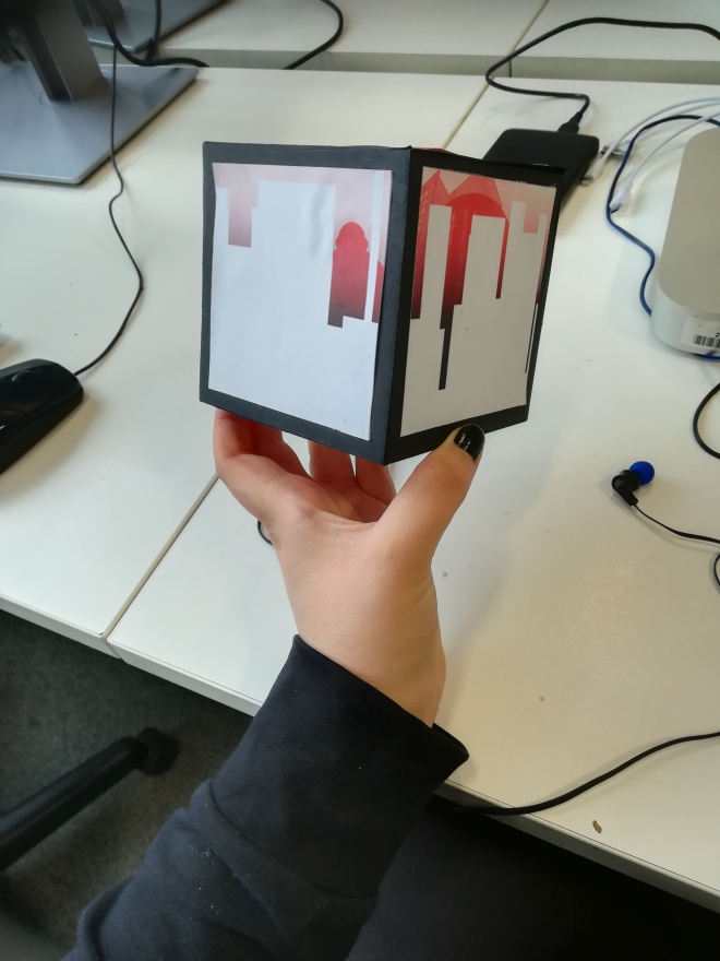
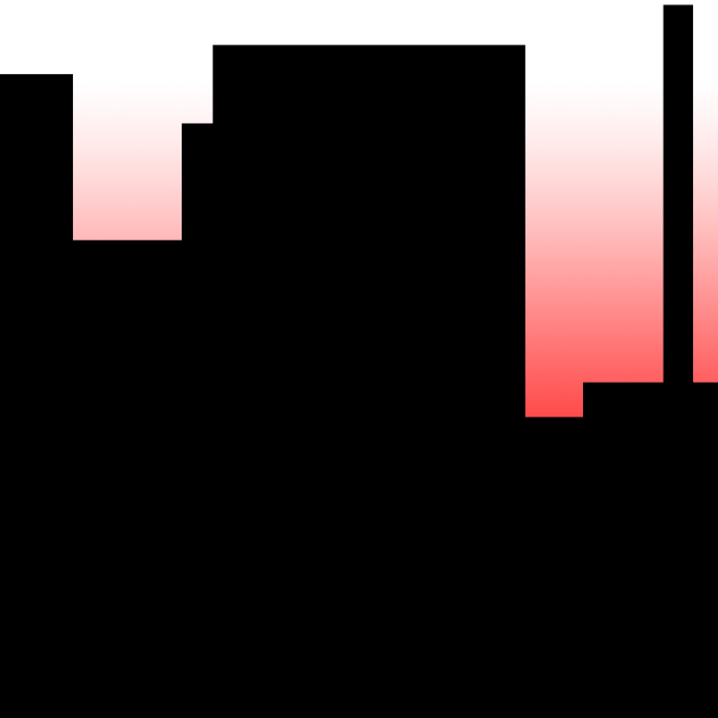
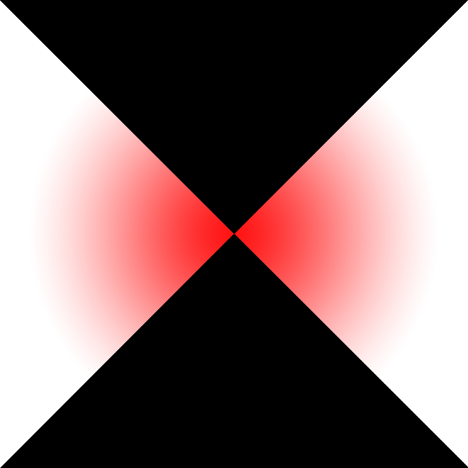
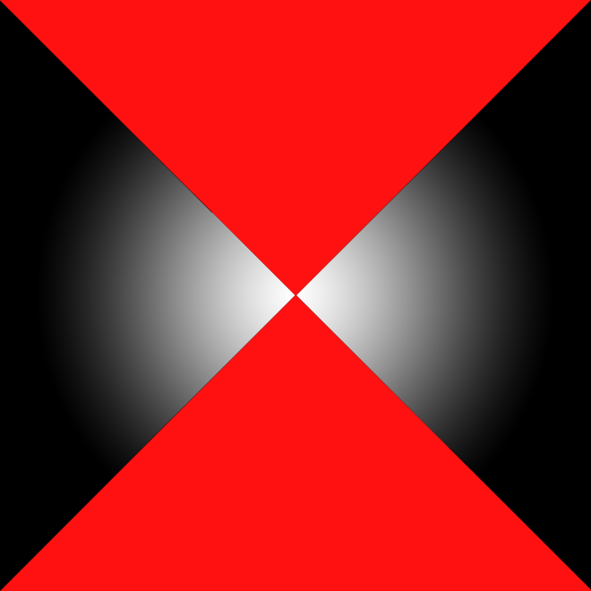
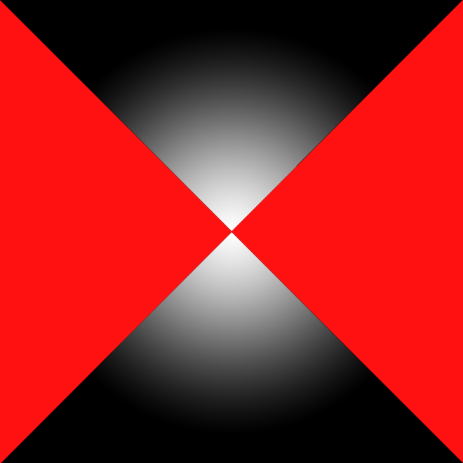
Now for the images. For the most part I used smart objects to create the skyline and words.

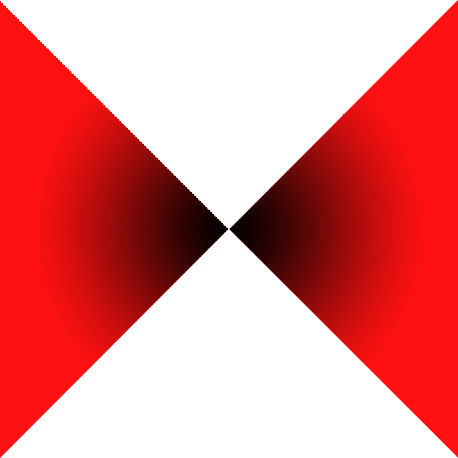
I used the gradient tool(both linear and circular) to create the gradients.

The images are just separate image files that I changed the layer kind to linear dodge

Back.png
back


Left.png
Left
Front.png
Front
Right.png
Right
Bottom.png
Top
Top.png
Bottom

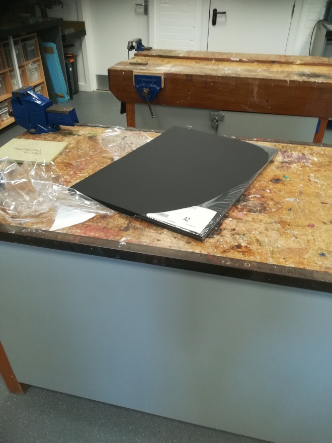
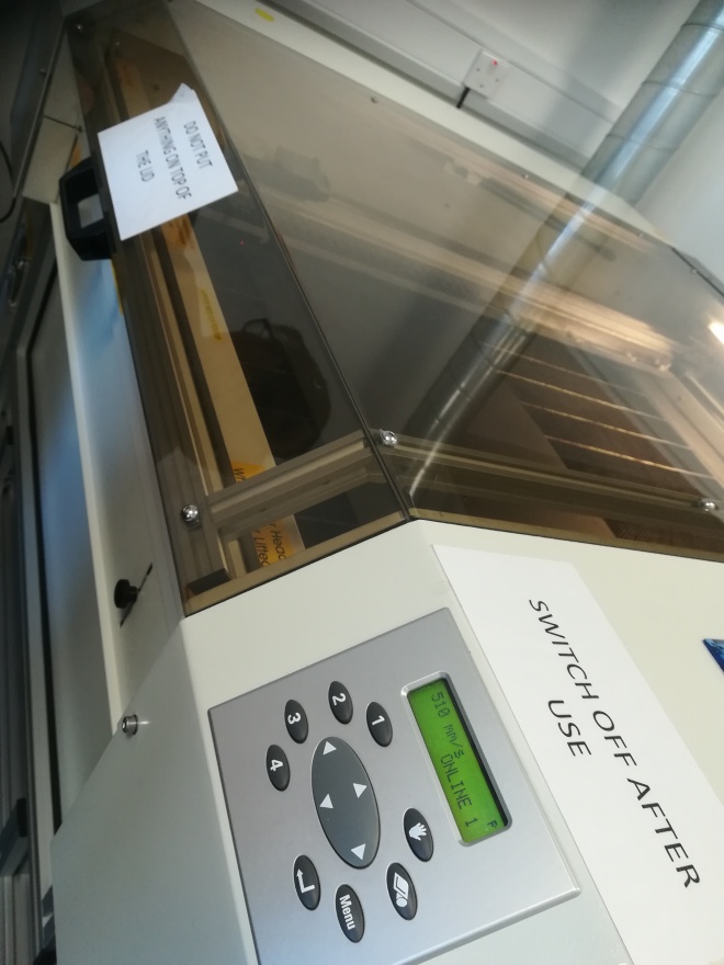
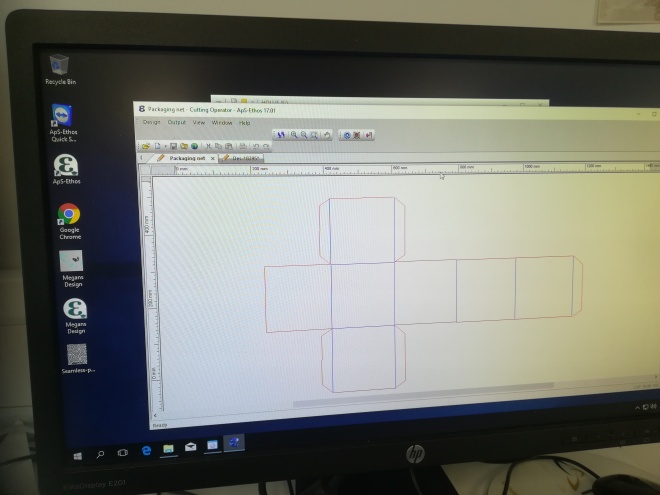
Laser cutting the net

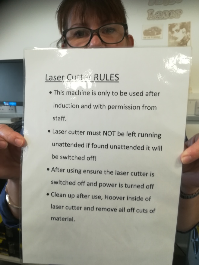
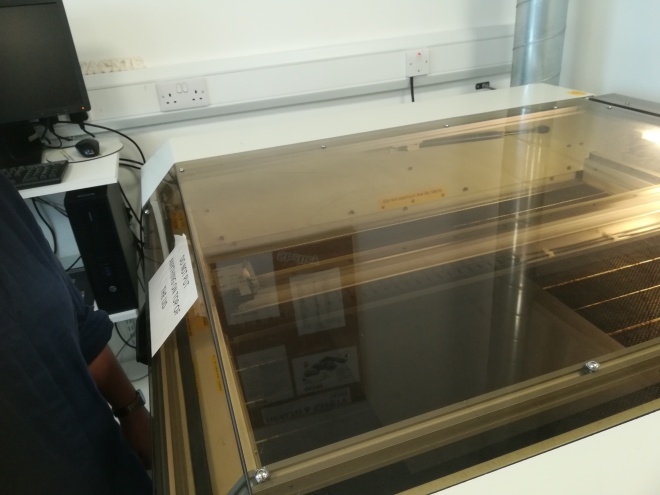
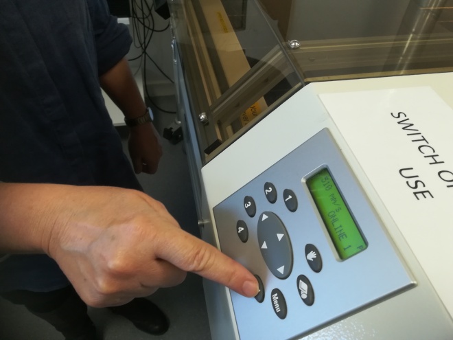
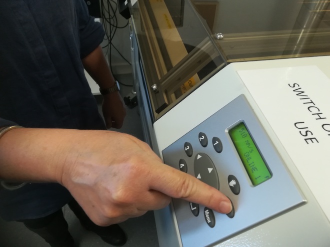
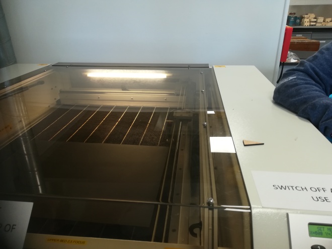
Setting up the laser cutter
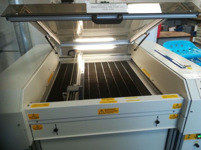
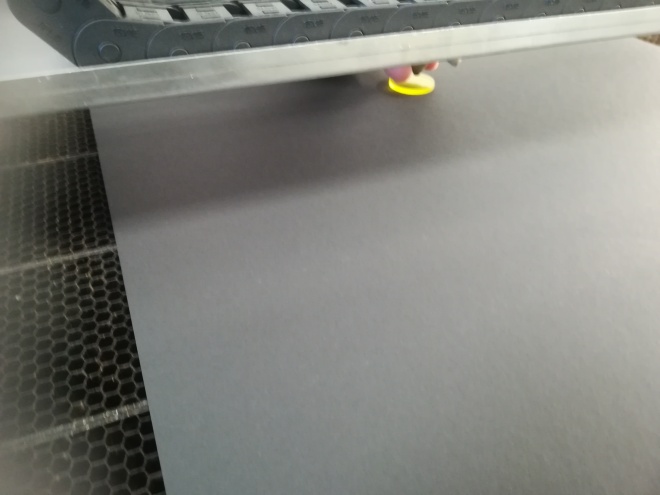
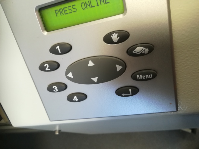
IMG_20181010_141533.jpg
This is the laser cutter
IMG_20181010_142048.jpg
If you make a mess, clean it with the vacuum

IMG_20181010_141809.jpg

IMG_20181010_142106.jpg

IMG_20181010_141708.jpgIMG_20181010_141724.jpg

IMG_20181010_141659.jpg

IMG_20181010_141848.jpg

Setting the cutterIMG_20181010_141644.jpgIMG_20181010_141648.jpgIMG_20181010_141650.jpgIMG_20181010_141652.jpg

IMG_20181010_142038.jpgIMG_20181010_142503.jpgIMG_20181010_142530.jpg

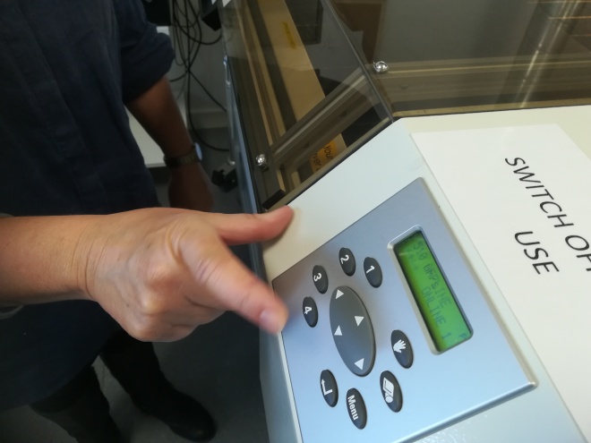
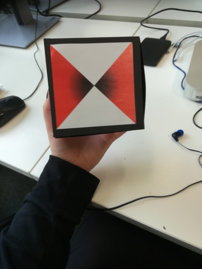
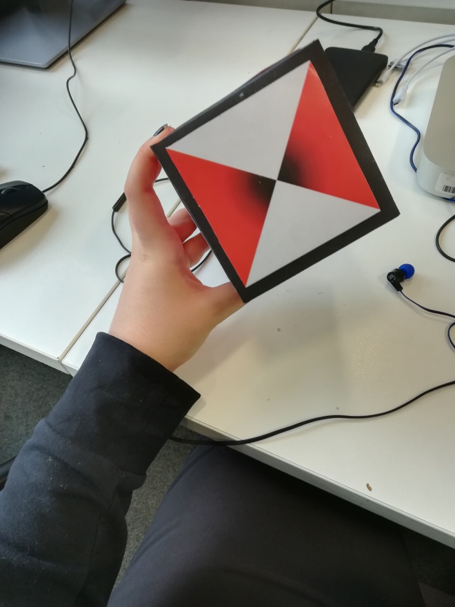
Putting it together plus final box

Once the net has been cut you just glue everything together

IMG_20181017_133059.jpgIMG_20181017_133104.jpgIMG_20181017_133107.jpgIMG_20181017_133111.jpg

Packaging

First Colour

I created the full skyline first on a 10×20 canvas. I used quad shapes to create it. Once i created them I added a layer unerneath all the shapes an created a red gradient with the gradient tool

Back.pngBottom.pngFront.pngLeft.pngRight.pngTop.png

Second colour

Back.pngBottom.pngFront.pngLeft.pngRight.pngTop.png

Third colour

Back.pngBottom.pngFront.pngLeft.pngRight.pngTop.png


Pakaging

Library packaging

I found this dvd box cover and it sort of reminded me of an amount case, which makes sense because it the movie itself is a war movie.

Just your standard run of the mill book covers. The reason why this particular cover caught my eye is because of the contrast of the title and the background. the Title is bright gold and red, the image is greenish and mostly greyscale.

Internet packaging

Mmmmm, mcdonalds. The packaging is bright and colourful and looks like it might hold something delicious. Which is the whole point, people see other people with the packaging and think “hey, I want some of that” and so they get their own and thus the never-ending cycle of see and buy continues.


This coffee looks fancy, also expensive. These patterns are familiar to me. Can’t remember what it’s called exactly. I remember my caretaker Rosie almost always used to wear patterns like this, thats why I picked this.

Urban Landscapes

1 untitled, Adam Fuss

IMG_20180910_151134.jpg

The first image is that of a swan

  • The white and blue contrast each other strongly, this helps bring the viewers attention to the swan
  • The image appears to have a filter on it, either emboss or negative. This gives a very unnatural feeling to the image
  • The body and wings are very symmetrical however the head is turned to the side, this brings about a sort of flow to the swan and thus calmness
  • Overall I quite like this image, it’s chilling and creepy yet soothing and calm

untitled, Alain Gilquin

IMG_20180910_151238.jpg

3 chrysemys scripta elegans(turtle skeleton), Jayne Hinds Bidaut

IMG_20180910_151403.jpg

untitled twins (joined), Dan EstabrookIMG_20180910_151509.jpg
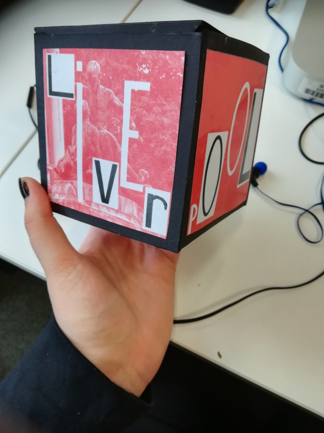
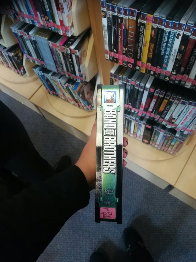
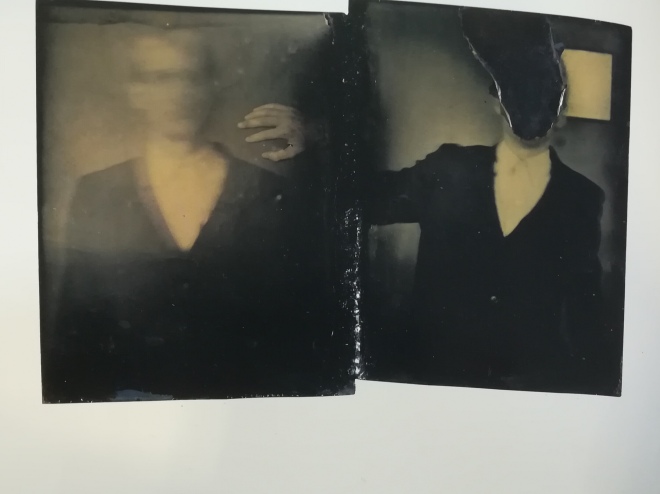
This is definitely one of the more chilling of the more chilling images, it is of two men, their faces obscured

  • The fact that their faces are obscured makes me feel that these two could be anyone, for some reason this is worrying to me as I do not know who they are. I can not see a visible face and that is making me nervous
  • The only thing in focus is the hand by the side of the left man. This could be that the hand, and the man on the right which one can only assume that the hand is from, is important.
  • While the man on the left has his face blurry, the man on the right appears to have had his face removed by perhaps being burnt out.
  • The man on left is facing forwards while the man on the right is turned to the side slight, towards the other man. This throws the symmetry of the image off as well as the hand near the left man. This makes one feel very uneasy.