Logo

As a person in creative media, I want my logo to show that I am creative and always doing forwards as well as I will get things done by their due date.

I will achieve this by drawing a person moving forewards with artistic tools on a timeline.


Some designs I first thought

From the start I had a pretty solid idea of what I wanted to do which was a person on a timeline
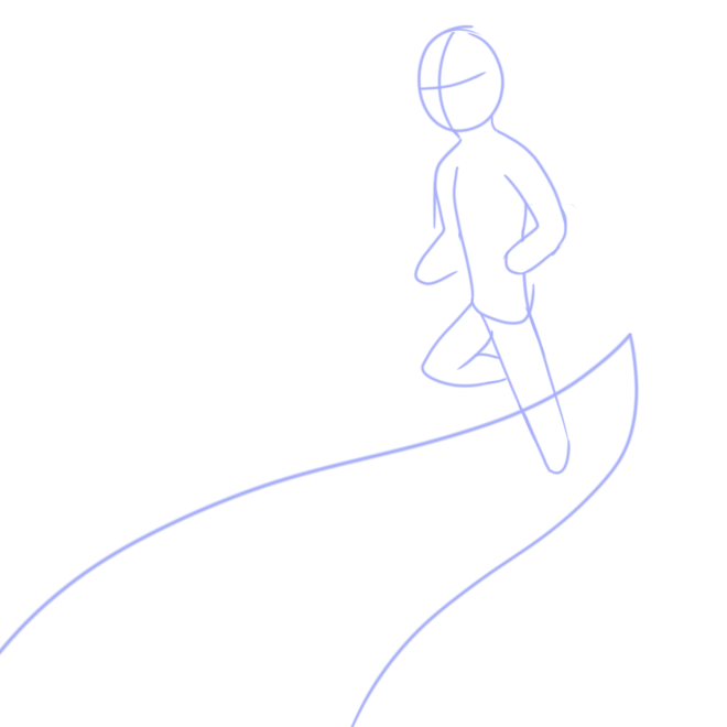
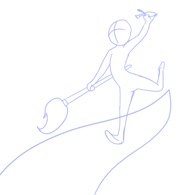
Logo 4.png
This initial idea was dumped because it felt off balance, even for a character in motion
Logo 5.png
This was dumped for the same reason as the first one
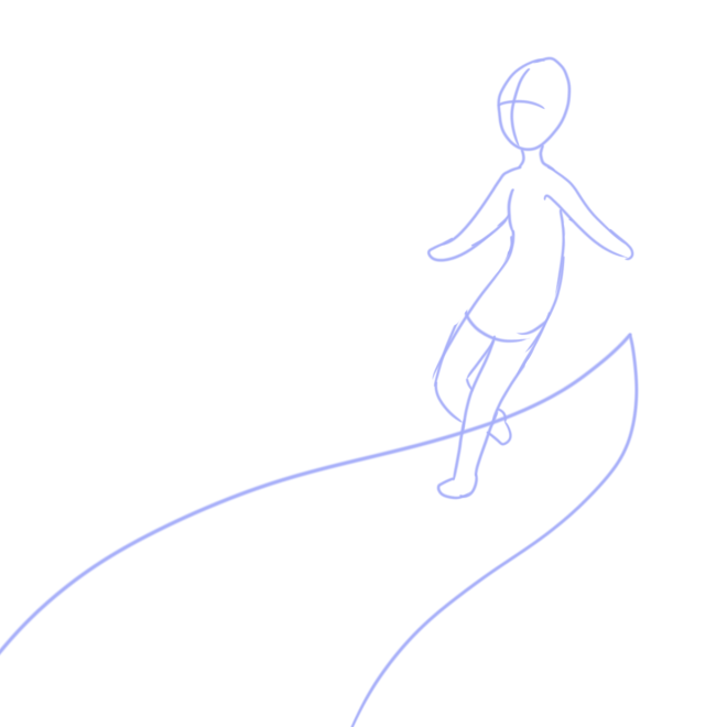
Logo 1.png
While I did like the carefree nature of this pose I was still not all that happy with it.
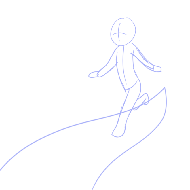
Logo 2.png
This pose felt like the character was way to cautionary and thus did not suit what I washing for at all.
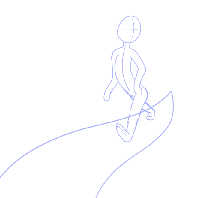
Logo 3.png
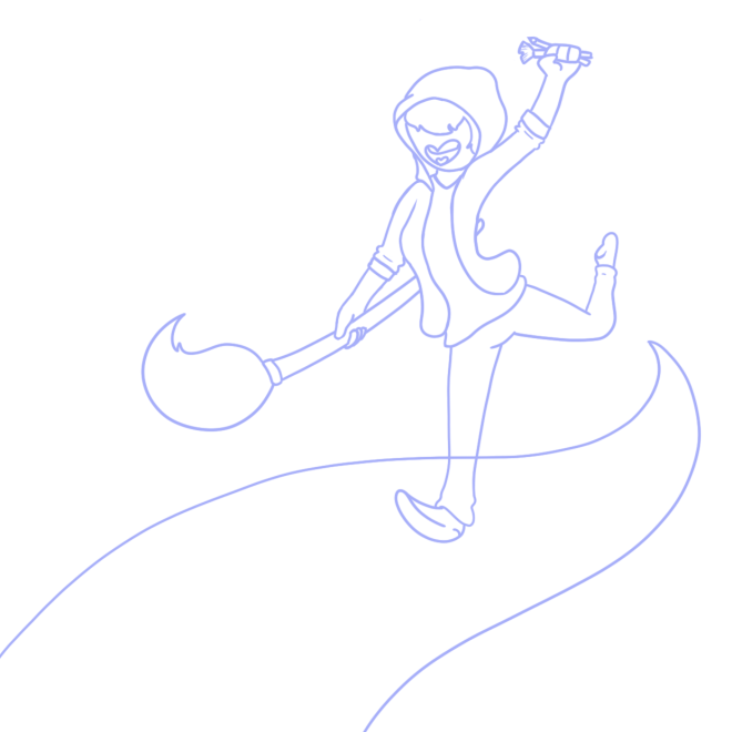
I ended up using this pose because it has a nice sense of motion. I also added some props

Screen Shot 2018-11-26 at 09.49.51.png
Some evidence of thing, I chose this pose
Logo final sketch.png
I then did a clean version with some other stuff.

Screen Shot 2018-11-26 at 12.14.11.png


With some help, I made a shape path from the Neat drawn lineart. Made it a vector by making a shape layer, copying the path and pasting it onto the shape layer. This proved to appear much nicer than what I was perviously doing and far easier.

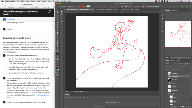
Screen Shot 2018-12-03 at 10.03.33.pngScreen Shot 2018-12-03 at 10.03.36.png


I then changed the colours and exported two versions. One is just a silhouette and the other is a lineart with the name of my thing

Logo Silhouette.pngLogo new.png


I then create a mockup on a black t-shirt

Mock.png


There is not muchI can say on the logo. I feel that it has some nice motion to it. It’s a bit complicated however its also a design that is easily replicated. It doesn’t quite convey that it’s meant to be an animation company but rather comics(which is something I do enjoy making). I am unsure how I would rectify this. Next is the one foot. It looks off, like the heel isn’t on the ground. I could probably fix this by changing the shape of the foot. I do not feel like there is anything else I would change, there was no possible way for me to manage my time better as I had to fit this in with all my other work as well as attempting to maintain some form of sanity by communicating with other humans.
Idle animation

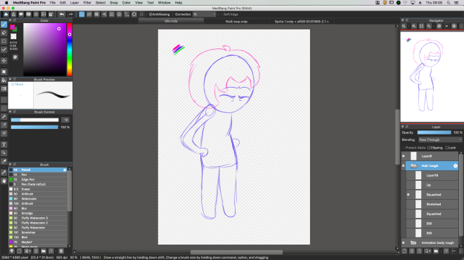
Screen Shot 2018-11-22 at 09.09.49.png
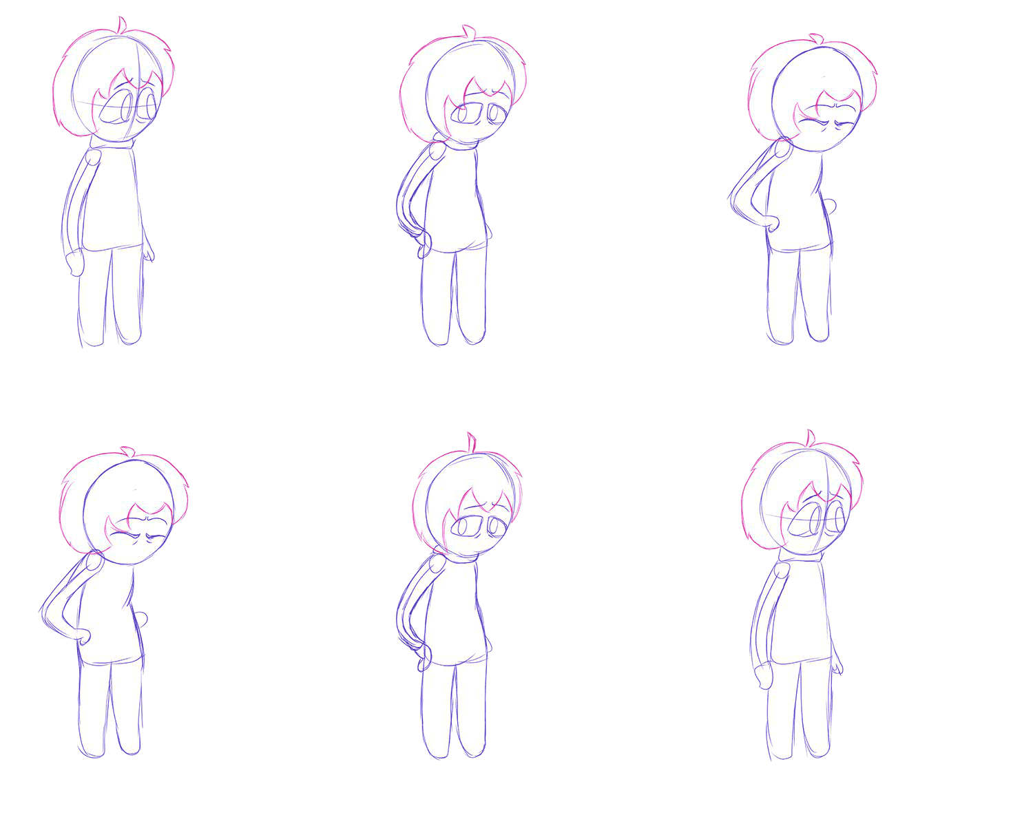
First I sketched out the frames in my art program
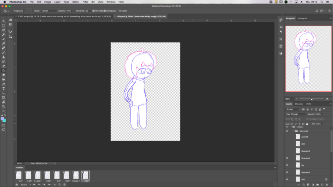
Screen Shot 2018-11-22 at 09.10.46.png
Then I imported it into Photoshop and animated it.
Look-around.gif
Here is the finished rough animation


output_thFTWY.gif
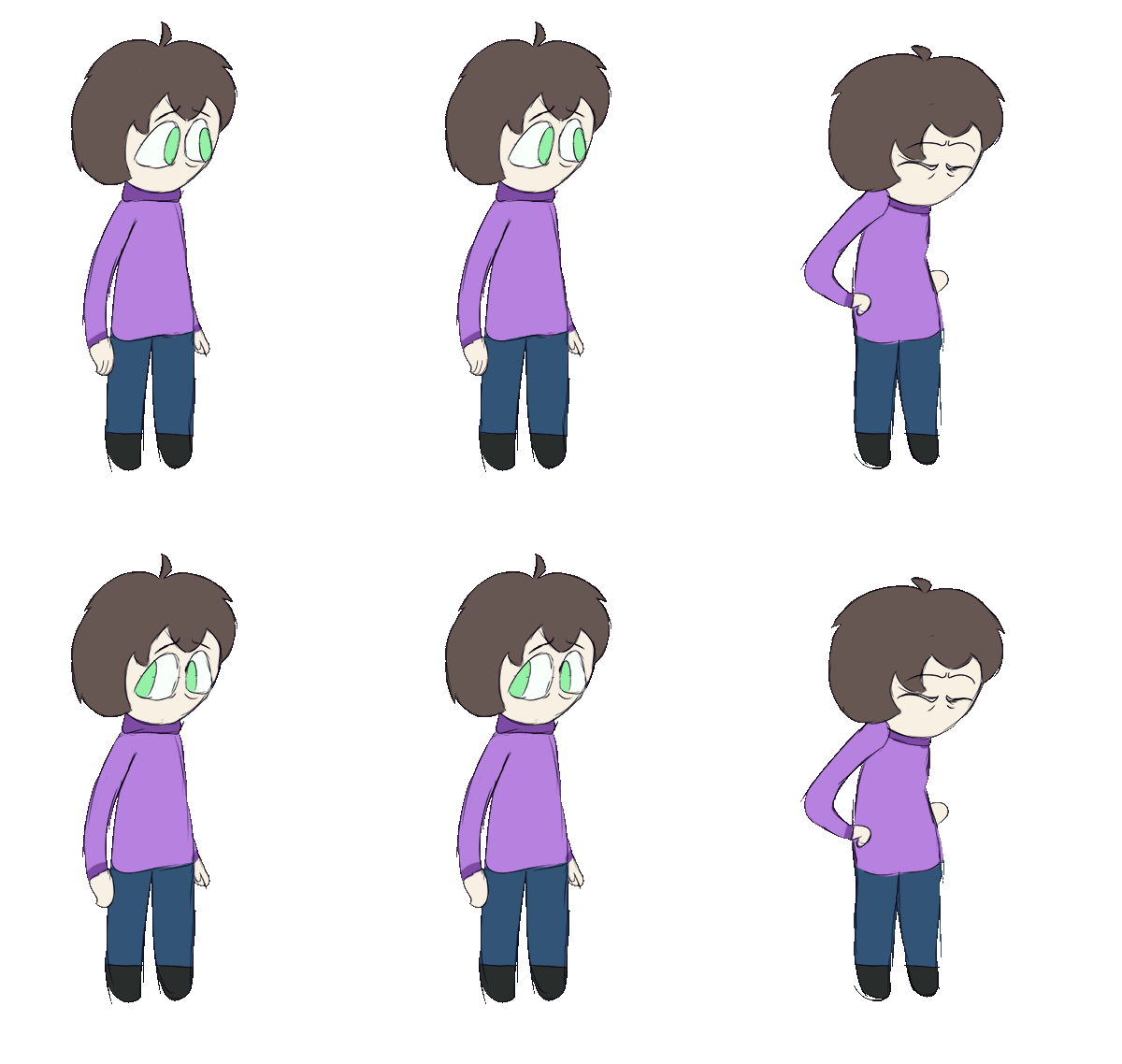
Added colour and cleaned up

Experimentation with media

IMG_20181114_150044.jpg
I really like the drip of this, the cut looking thing at the bottom was made by letting red and black ink drip down the side then splatting a brush with red ink on it down the line

IMG_20181114_150053.jpg

IMG_20181114_150822.jpg
Most of this is made with ink on a paintbrush. The clock eye is dry brushed
IMG_20181114_150813.jpg
Pretty much all the same. The splats are made by splatting the paintbrush on the paper

IMG_20181114_150829.jpg

IMG_20181114_150913.jpg
This is the result of using tissue paper to clean the brush and remove excess ink from the paper

IMG_20181114_155230.jpgIMG_20181121_152838.jpg

All game designs

To start off, I had a pretty solid character design set in my head. That design being a very cute character with no mouth. I took a lot of inspiration from a game called Undertale(mostly the fanart of it) as well as several other games such as the binding of Isaac. I also drew inspiration from the design of Mable from Gravity Falls.IMG_20181114_100916.jpgimg_20181114_100926.jpg


Eventually I ended up with this design that’s far more simplistic and easier to turn around. I also created a few items for the false screenshotSprite and tools.png

Promo art2.png
A sort of art I made because I wanted to test out some effects I wanted to use for the game


I created a Youtube playlist for some inspiration for the game. Link to playlist


Screen Shot 2018-11-14 at 10.37.17.pngThe trees for the background gave me quite a bit of trouble but I’m actually quite happy with how they turned out

Screen Shot 2018-11-14 at 11.22.27.pngI added some shading, the character and the On screen display. I decided to add an enemy to make it more visually interesting so here you can see the quick sketch I made.

Fake screenshot.png


I got board and made an icon in MsPaint.

Capture8.PNG
This was no easy task. I mostly did this because I had already completed the homework I could complete(Library computers don’t have photoshop or the correct driver needed for my wacom to work). I mostly struggled with the hair and I’m not entirely satisfied with how it has come out but there is nothing I can really do about it.
Charac Iconnew.png
I just noticed a section that is too wide so I’m going to fix that
Charac Iconnewnew.png
Completed image. I really do like this image a lot.

Game progress

Splash Screen

I chose to use Medibang Paint to draw the Splash Screen as I am most familiar with the program as well as I know how to create custom brushes in it.

Screen Shot 2018-11-07 at 13.53.06.png

Screen Shot 2018-11-07 at 13.52.10.png
Animated the words coming in and glowing
Screen Shot 2018-11-07 at 13.53.31.png
Exported to web, did the same with Base menu


Base menu

I chose to use Medibang Paint to draw the base menu as I am most familiar with the program as well as I know how to create custom brushes in it.

Screen Shot 2018-11-07 at 13.53.09.png

Screen Shot 2018-11-07 at 13.52.00.png
Animated the arrow moving


On screen display

Fake screenshot.png
Here’s how I’m sorta panning on having the on screen display