Essentially what I had to do was design a game. It was not necessary to make the actual game, just design it.
What I chose to do for this project was a side scroller. The story essentially follows a small child on their journey through the night. At least that is the part being used for this brief. This has become very much a personal project and thus I will be changing the format to make it a bit easier, however that is irrelevant to the brief.
As the brief is “express yourself” I decided that I would show essentially how I feel sometimes. As I have a speech impairment, I sometimes feel like simply not talking as it is a lot of effort(in order for me to properly form sentences and words I need to concentrate on what I am saying). More specifically it focuses around my childhood, or at least that is what the initial plan was, this project has taken up a life of it’s own and has this become more.
The title for the game came from the fact that the character does not speak and is essentially a mute.
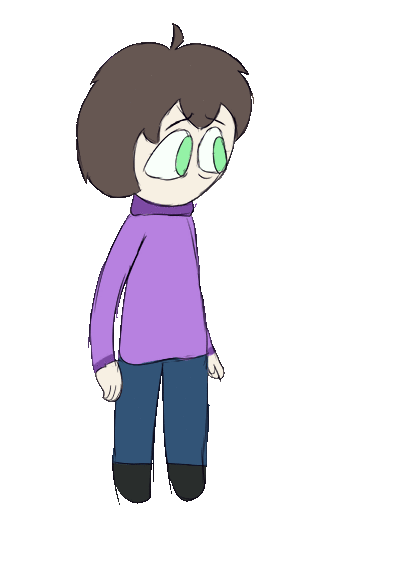
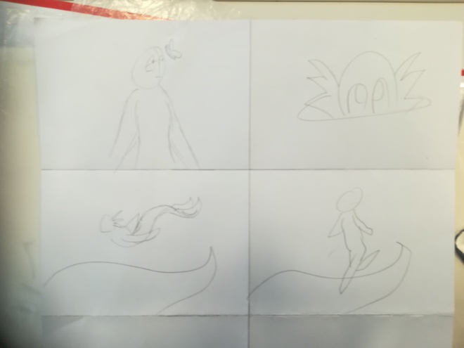
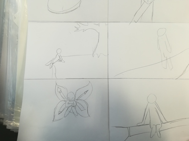
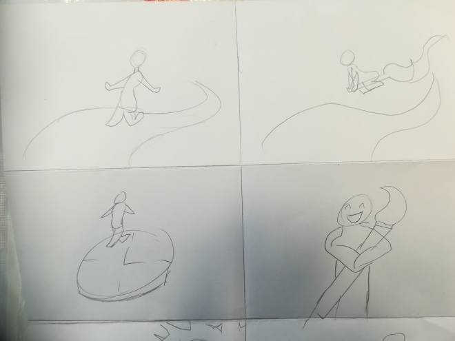
First I had designed the main character, whom has even somehow gotten a name as I couldn’t just keep calling them “child” or “character”. The initial ideas were all sketched out in pencil.

The next thing to do was to create a digital design of Charik, the character.
For Interactive media I made the splash screen, Start up menu and the game screen.

For these I feel like it would have been better if I had loop animated the snowflakes falling for the splash screen.
In Animation I had to make an idle animation as well as a signature move animation so here they are.

In this case my research did help up to a certain point, it game me a pretty good idea of how a base menu should be played out as well as how a game screen should look with the fake screenshot. When designing the character it came in use with their outfits and basic body shape.
I only really gained a couple of skills from this that I did not have previously, those skills are making things look like they have an intense light inside and drawing magic.
I am fairly pleased with the results. While I am not all that happy with some aspects of the animations and the splash screen, I feel as though this is merely the beginning of something far greater.

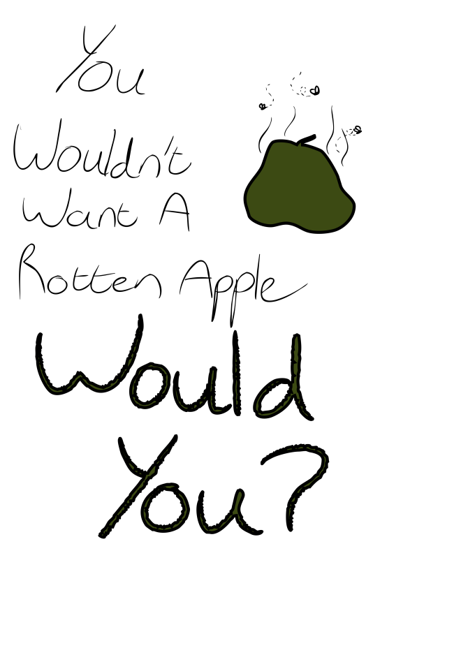
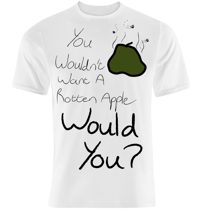
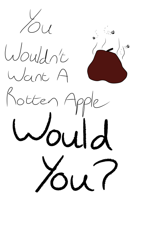 Its a rotten apple in the shape of a ballsack. I really like this design. That is not a font, it is my own handwriting. The large letters were made by using a custom brush.